Designing the new server callback creator for Adjust clients
Background & context
Clients use the server callback feature to receive real-time app information (advertising IDs, attribution details, and app data) in raw data form sent from Adjust. They do this by building a URL link.
The problem
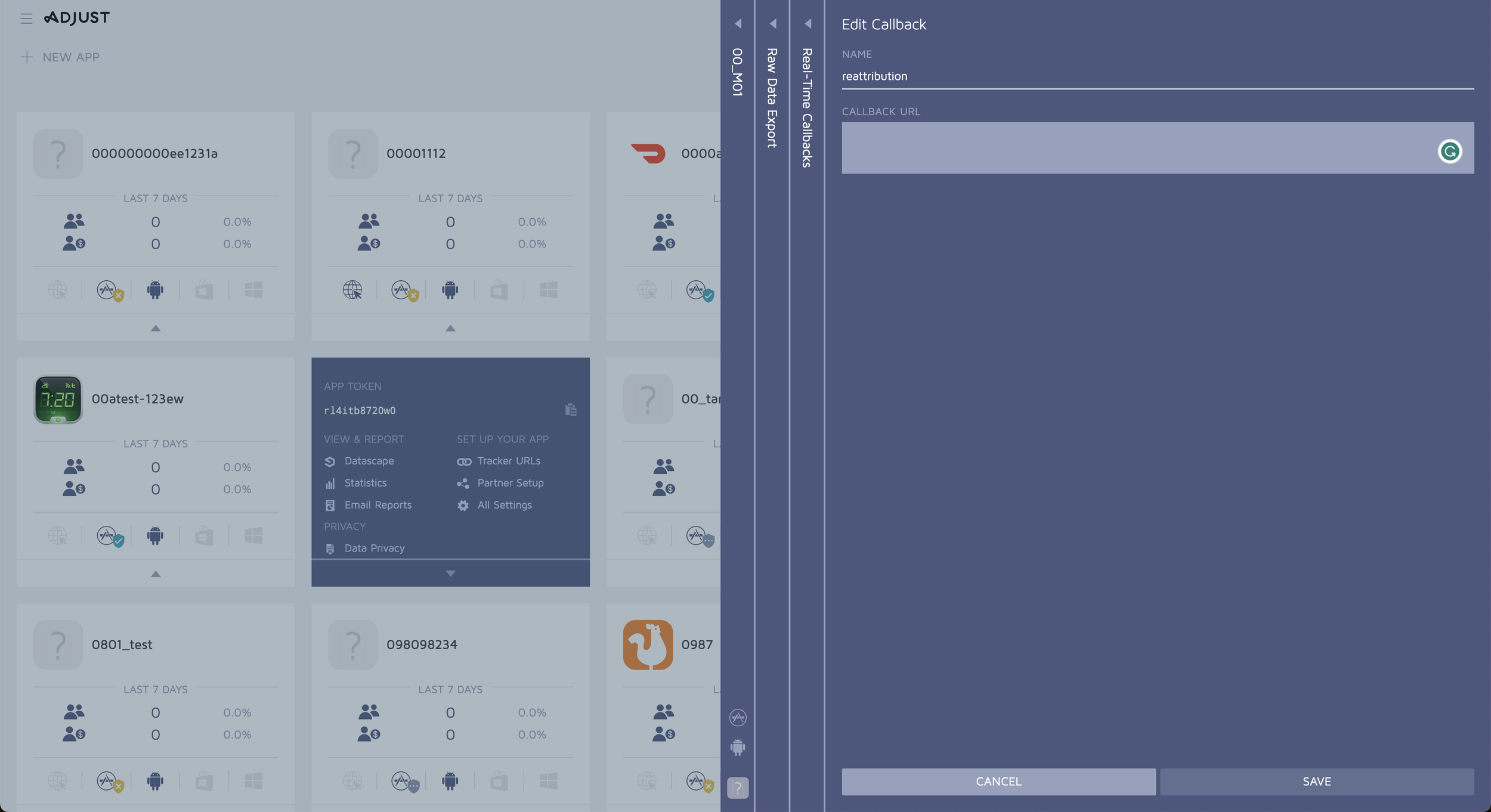
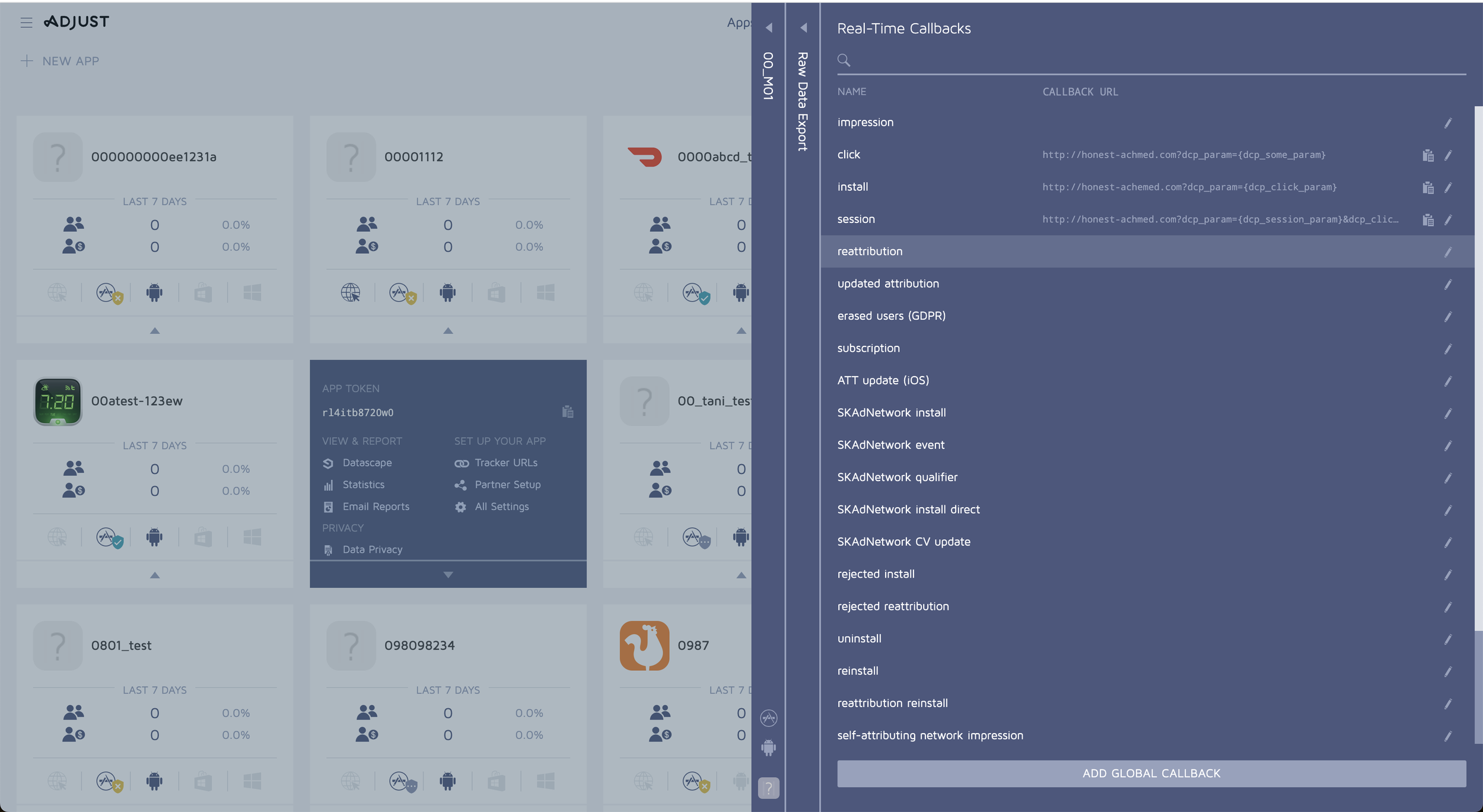
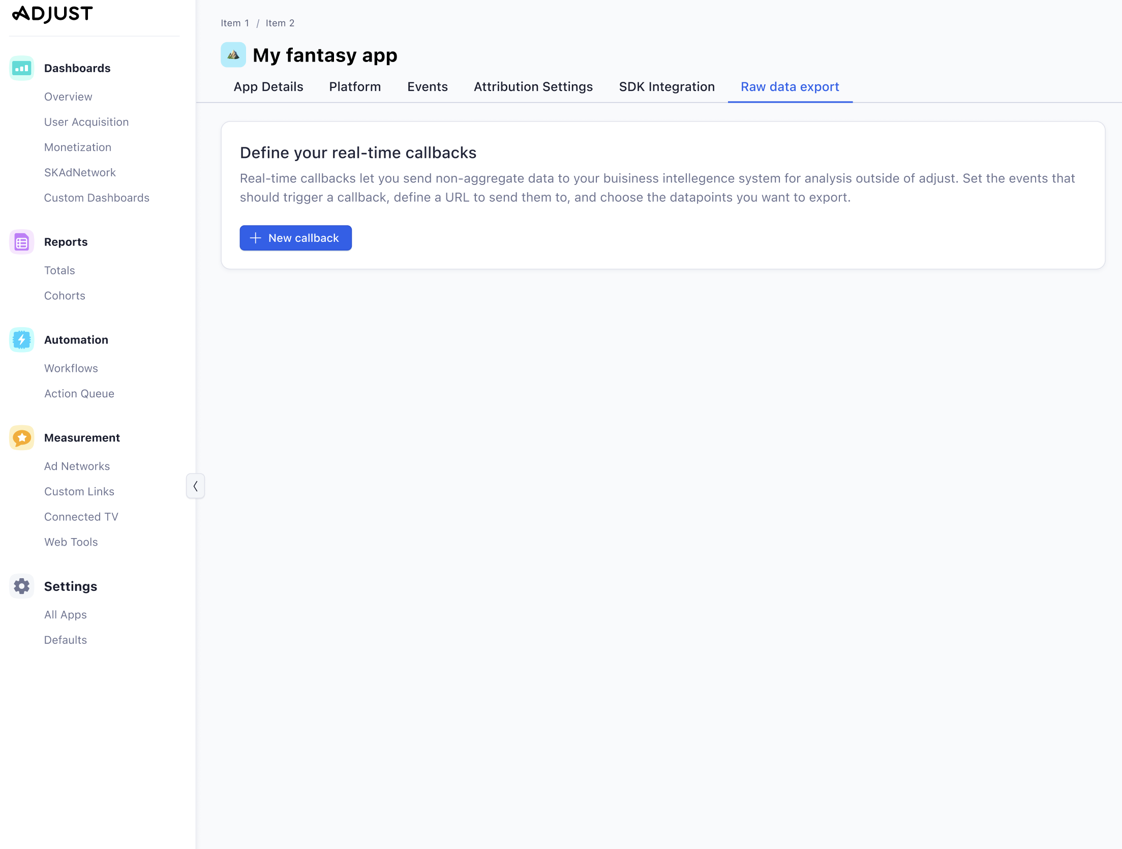
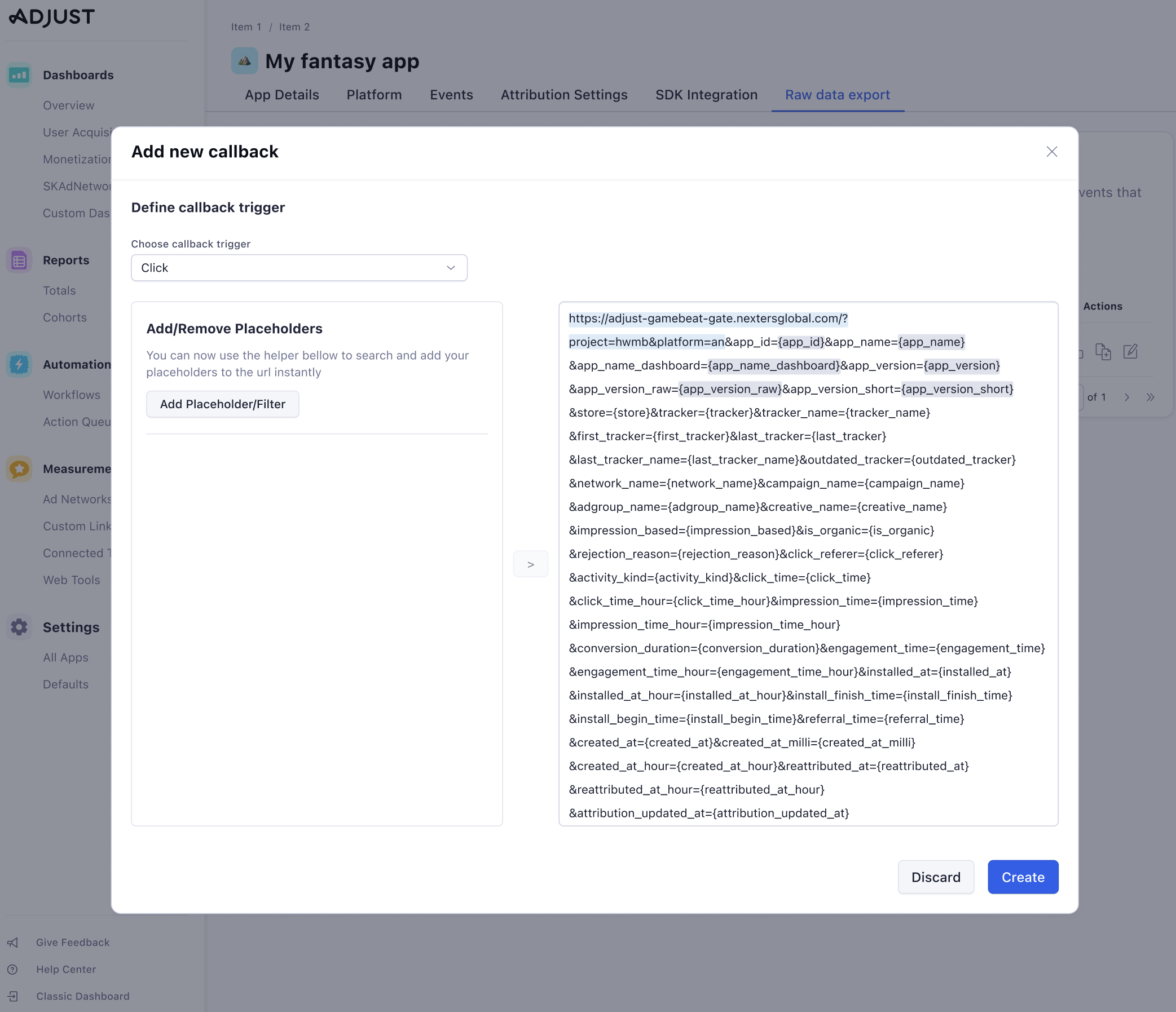
In the classic version (screenshots below), clients had to manually build their URL link by hand, using the help centre articles as a guide. See in the examples, there’s no contextual help or prompts in the classic version to guide the user.
Users (especially from a non-technical background) felt a lack of confidence when attempting to create their link when it was so technical.
My role
I was the sole UX writer in an agile team of developers, engineers, a QA engineer, a UX designer, a UX researcher and led by our product manager.
I was responsible for all UX copy in the user flow and testing copy. I used JIRA tickets and epics to keep a measure of my work.
Worked closely with the designer, giving and receiving feedback on copy, design and information hierarchy decisions.
Led meetings with technical writers, product owners, product marketing and program managers to discuss terminology and potential changes to these terms.
Attended weekly planning sessions to provide updates on the copy.
Ensured all translations were requested, received and then pushed to production using Contentful, Smartling and liaising with the localisation team.
The solution
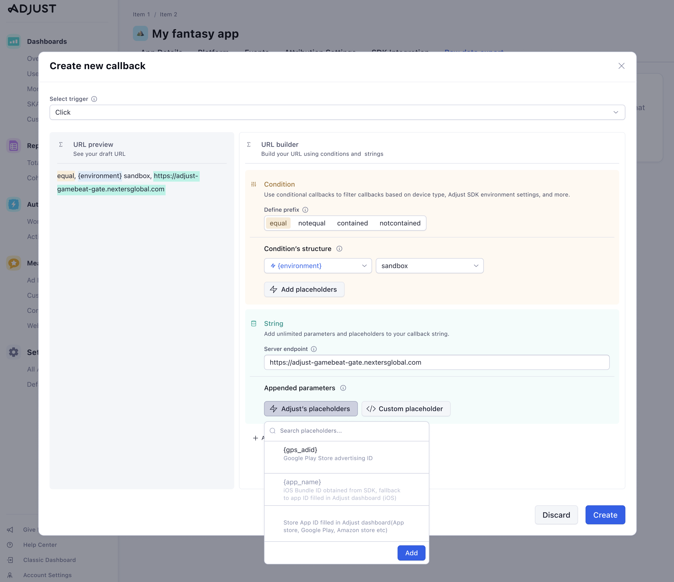
An entirely new UI and flow were created to replace the classic dashboard.
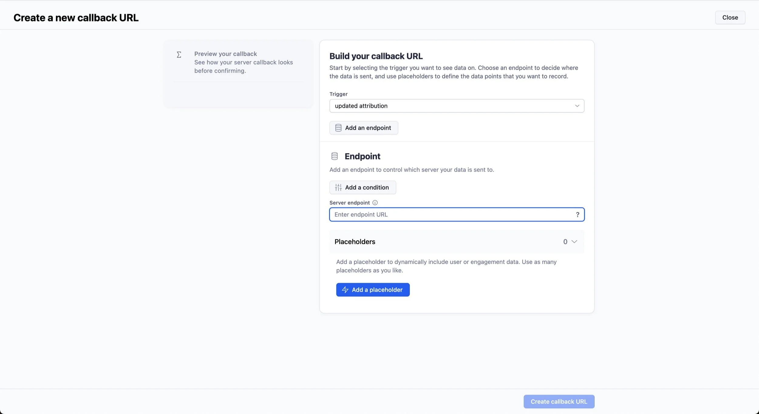
We designed a ‘guided setup’, whereby we walk the user through step-by-step and offer more contextual help such as tooltips.
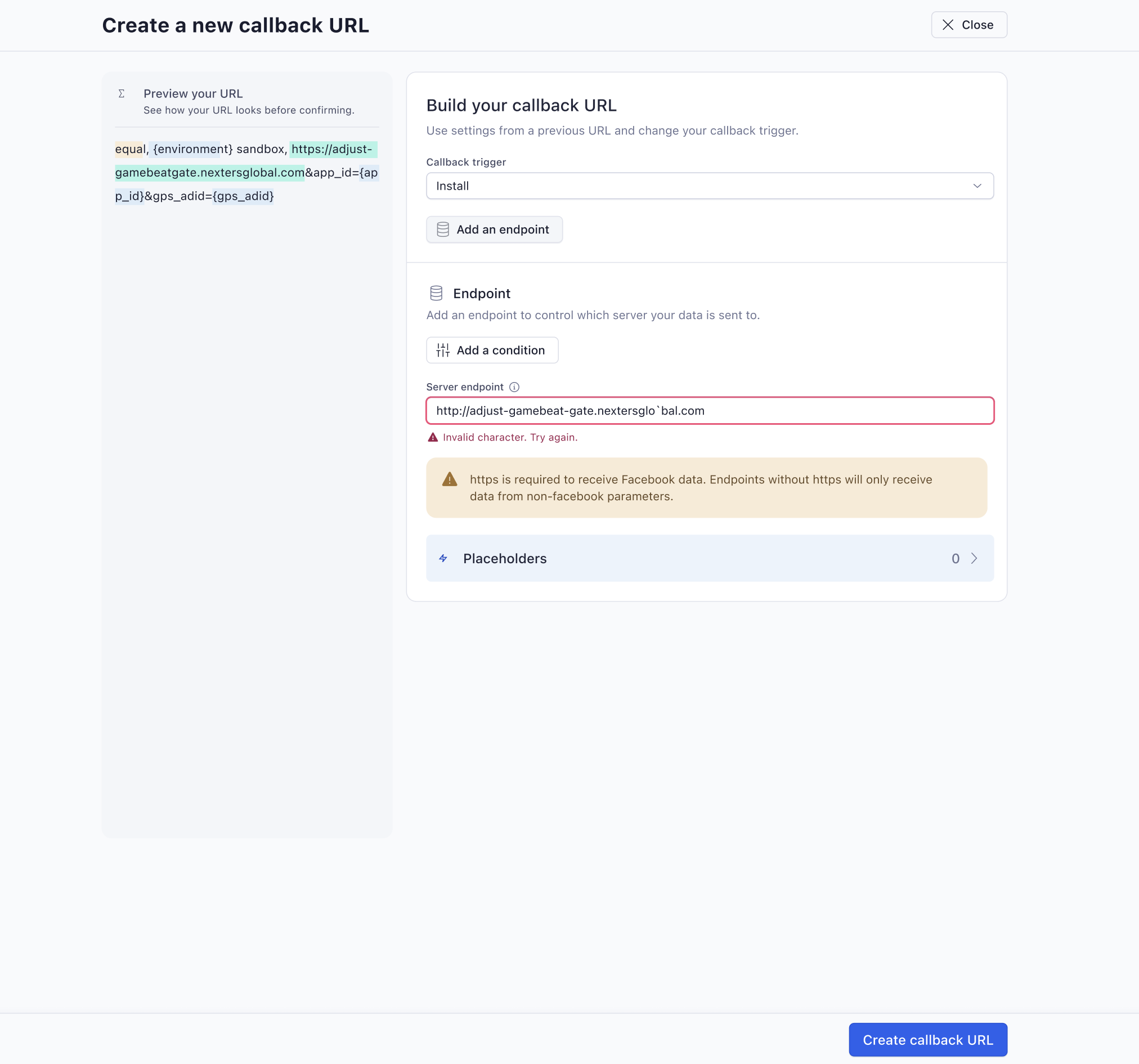
In-line validation and error messages were incorporated.
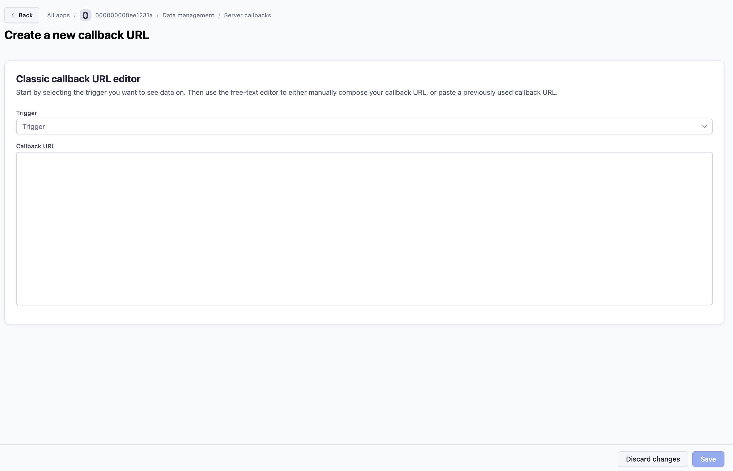
We also kept a classic builder so users can still manually build a link, or copy and paste a link.
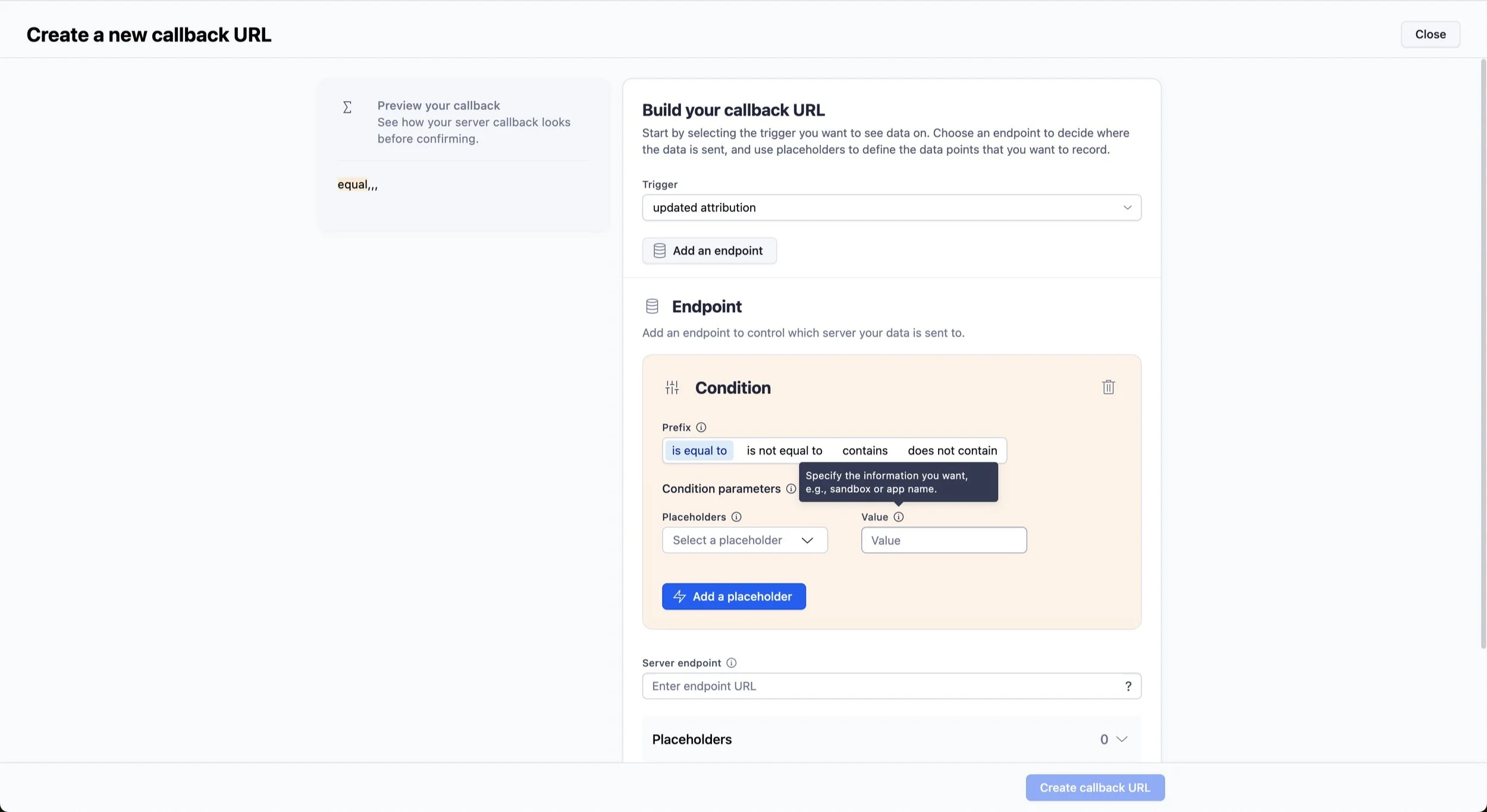
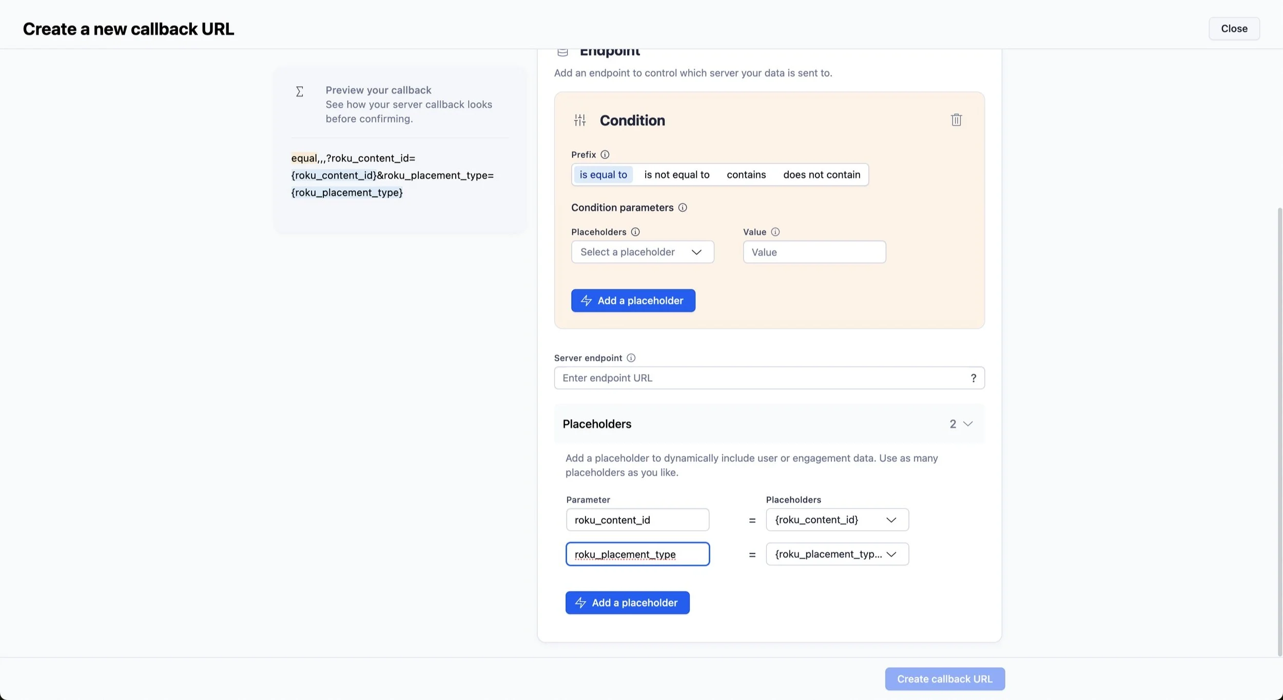
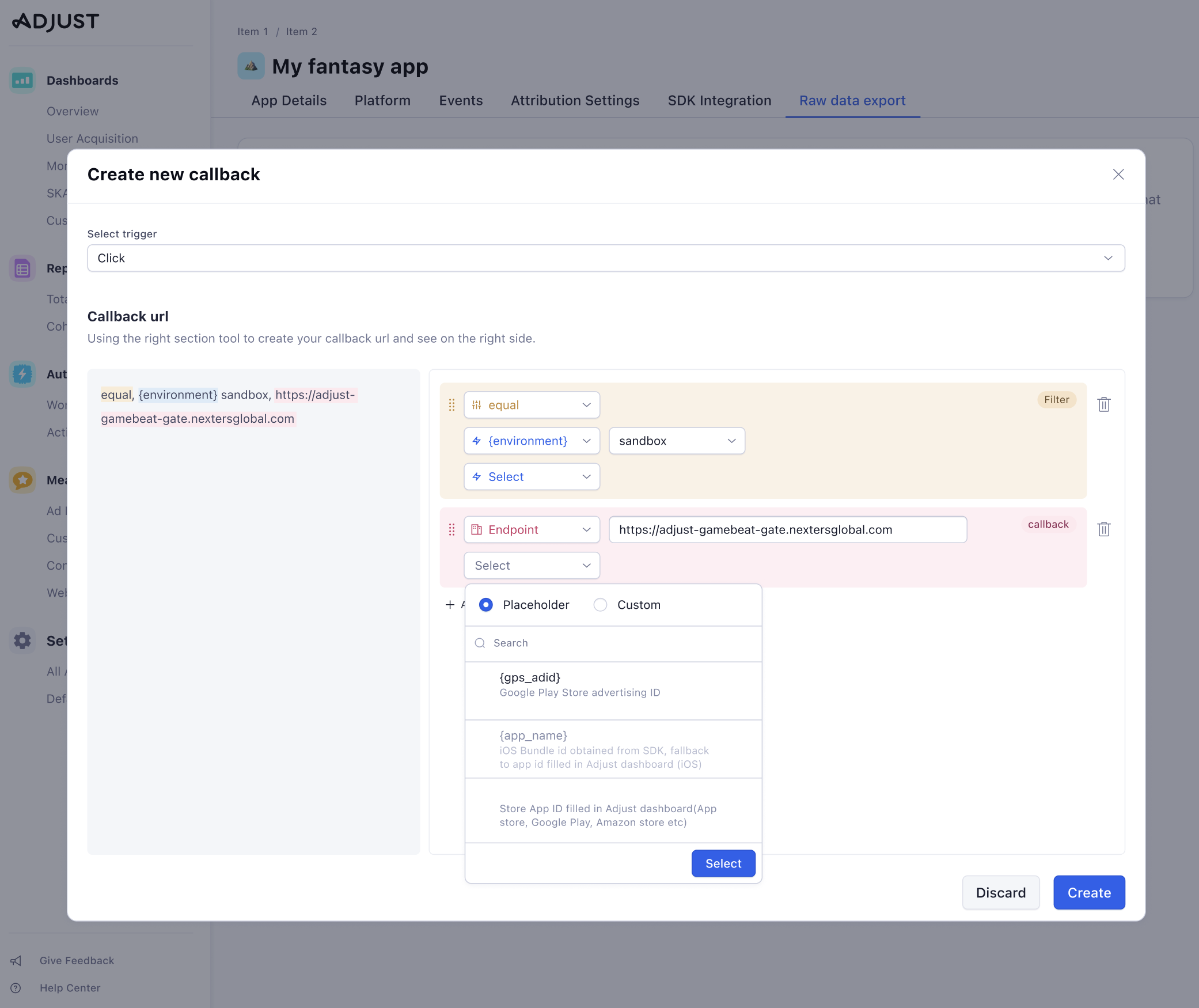
The examples below show the progressive reveal so as not to overwhelm the user. Contextual help was incorporated to educate the user on why they require each part and where to find the necessary information.
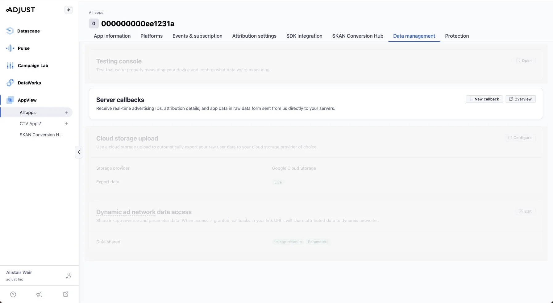
The first page in the new flow - users select 'New callback'.
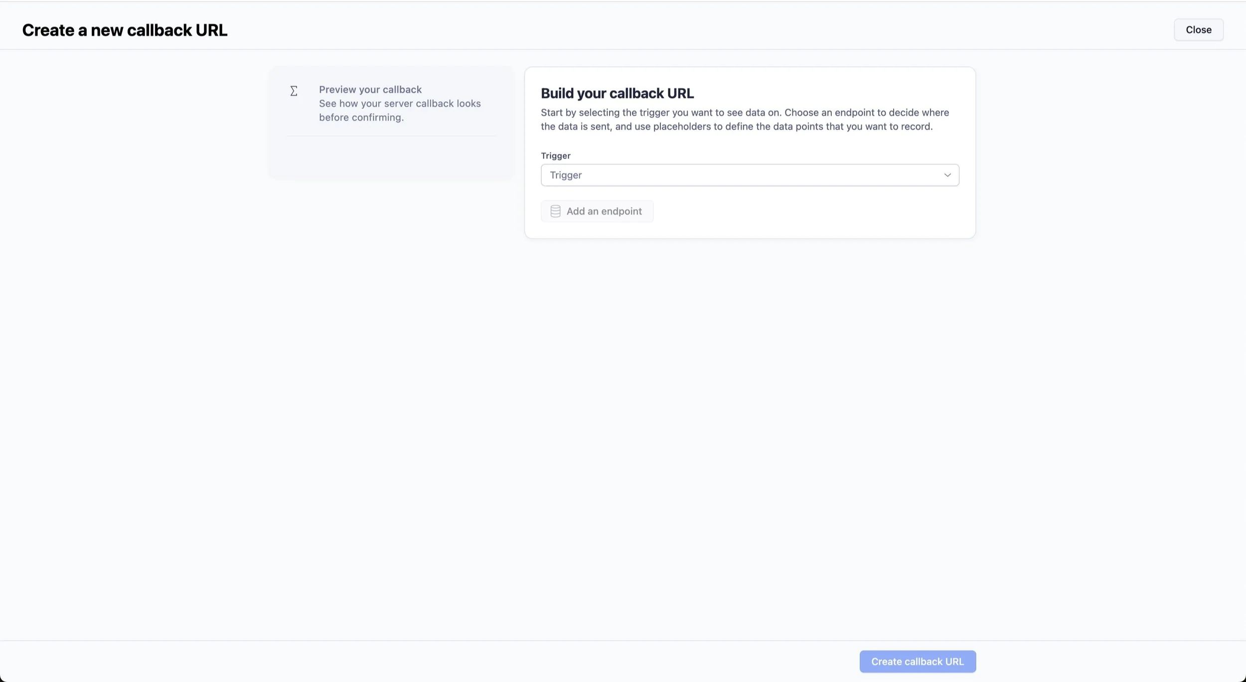
Now they select the trigger.
Notice the progressive reveal as the user progresses through the flow.
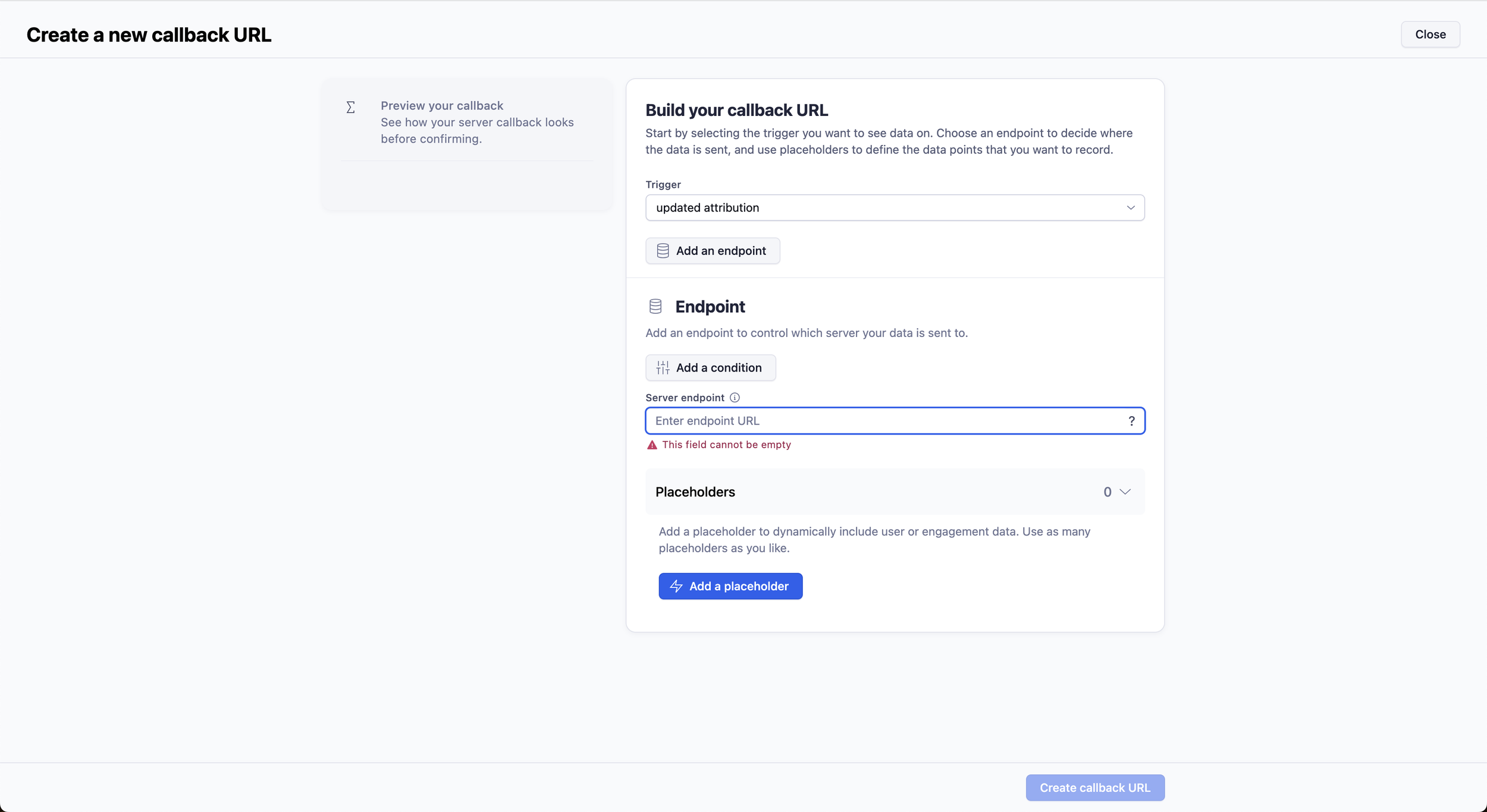
New contextual help and tooltips added.
Notice on the left-hand side the user can preview their link.
In-line validation was added.
More in-line validation.
An example of the classic builder in the new UI.
How did we arrive at the solution?
Initially, I worked closely with the designer and researcher to identify user pain points. The designer and I created some high-level flows in Miro.
After working on these, we moved into Figma to create some early drafts together. Some prototypes were created for feedback.
We received design feedback from the VP of Product, and technical feedback from the developers and engineers. I also asked for feedback from the UX writing team in our weekly peer review sessions.
We then moved to user testing. We led moderated testing sessions with experienced Adjust clients. We gave them access to the prototypes and asked them to complete scenarios such as ‘add a Condition’ and ‘where would you go to add a placeholder?’
After user testing, we incorporated all feedback to create the final live design.
Some early prototypes are below:
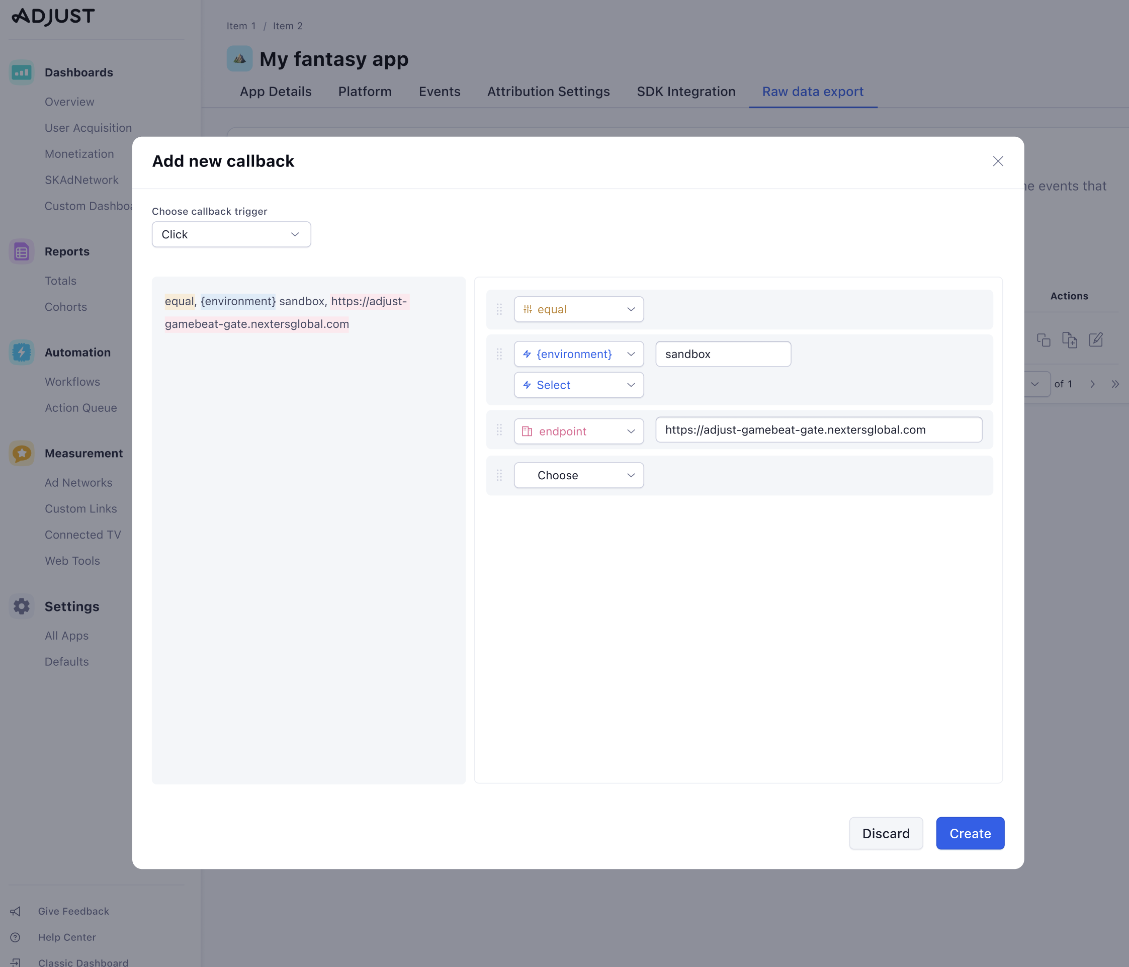
An early version of the navigation page - note the change in wording and terminology.
An early version - note we initially wanted users to add placeholders on the left-hand side and show the URL link in the main area.
Now we move more towards the final version - the user builds the link and appears on the left hand side
An early prototype of the final version.
An early prototype of the final version.
What challenges did I face?
Working in an agile team, various early proposals were rejected by the engineering team as just not possible.
Occasionally disagreeing with the designer on copy, copy placement or suggestion of tooltips. For example, under the Condition segment, the designer wanted to keep notequal and other conditional types since these labels are technically correct. I argued for more user-friendly options such as is not equal to.
High pressure from the product manager to have this finished. This meant a fast-paced work environment where more user testing or discussion around copy was sacrificed for speed.
What did I learn?
I learnt when to back down on disagreements with others but also when to influence and push when I believed in something.
Writing copy in designs that were only a few days old and then being tested. A constant feedback loop.
The ability to let go of perfection due to time constraints.
