Creating a new user sign-up flow
Background & context
Adjust’s previous dashboard and UI were out of date and clunky, creating a poor experience for the user.
An entirely new UI was created to replace the classic dashboard.
The problem
As part of the new UI, a new account creation/ sign-up flow was needed.
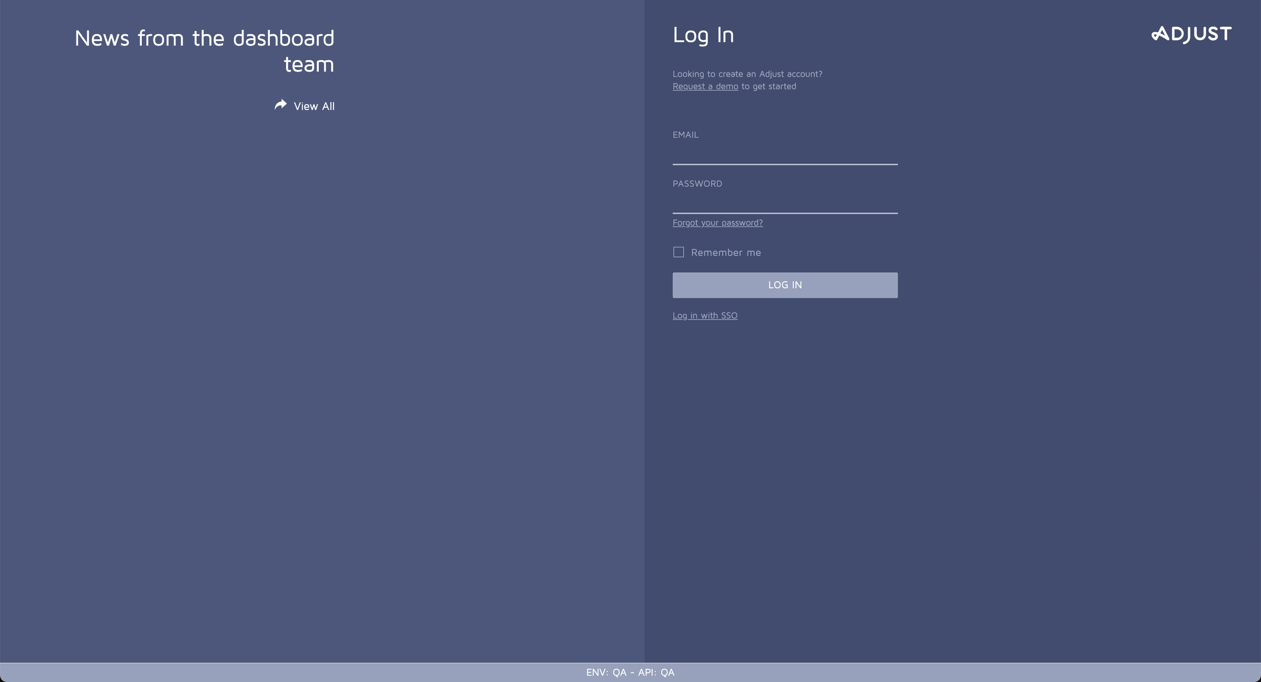
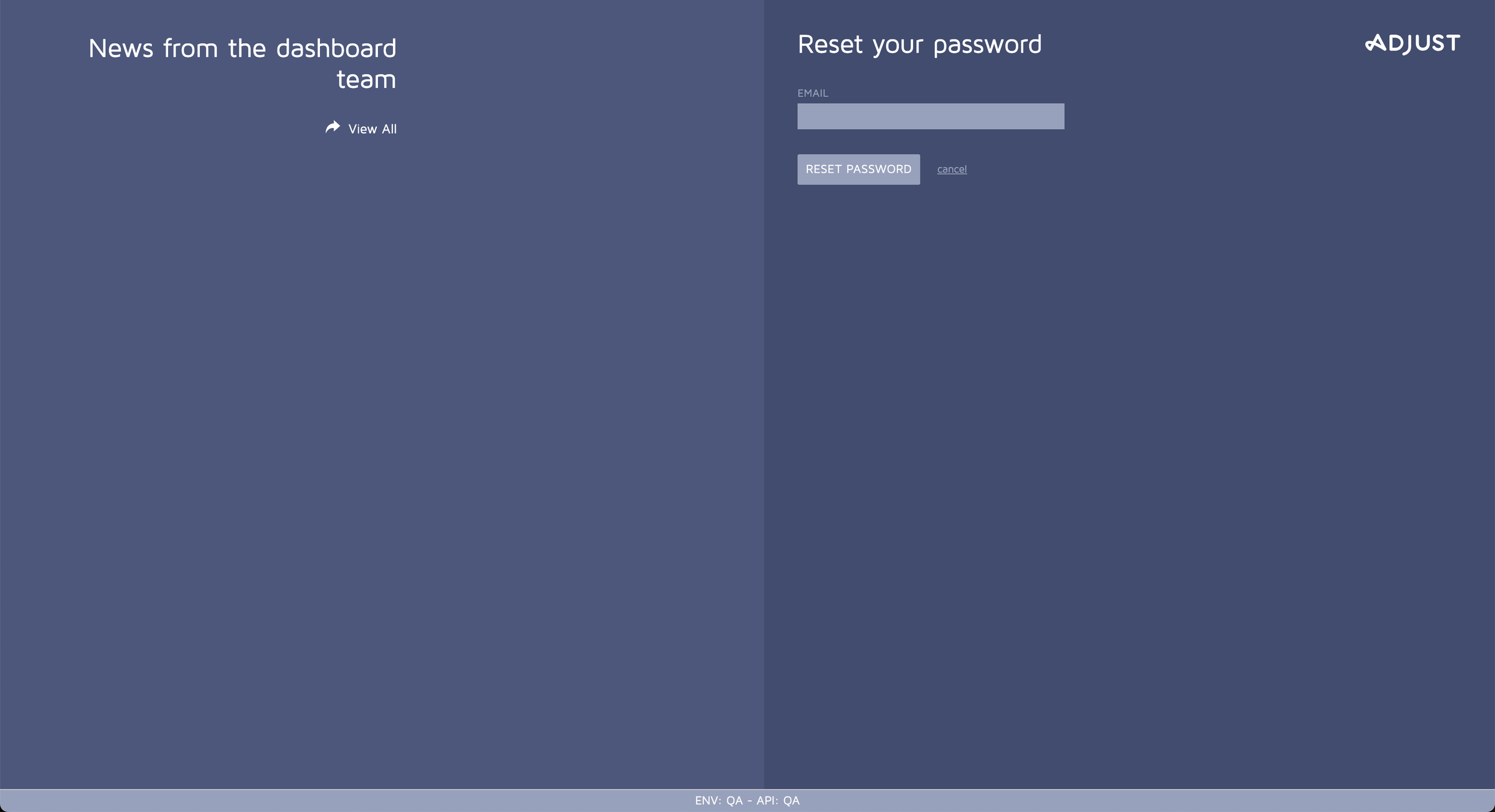
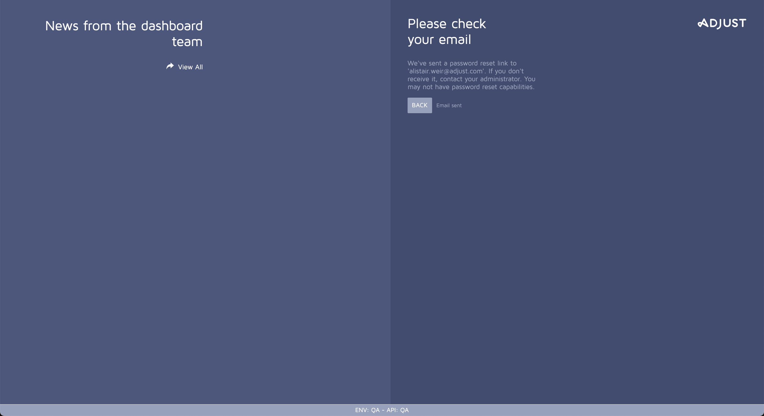
In the classic version (screenshots below), the flow and copy were dry, dull and lacking Adjust character.
My role
I was the sole UX writer in an agile team of developers, engineers, a QA engineer, a UX designer, a UX researcher and led by our product manager.
I was responsible for all copy in the user flow, testing copy. I used JIRA tickets and epics to keep track of my work.
Worked closely with the designer, giving and receiving feedback on copy and design decisions.
Attended weekly planning sessions to provide updates on the copy.
Ensured all translations were requested, received and then pushed to production using Contentful, Smartling and liaising with the localisation team.
The solution
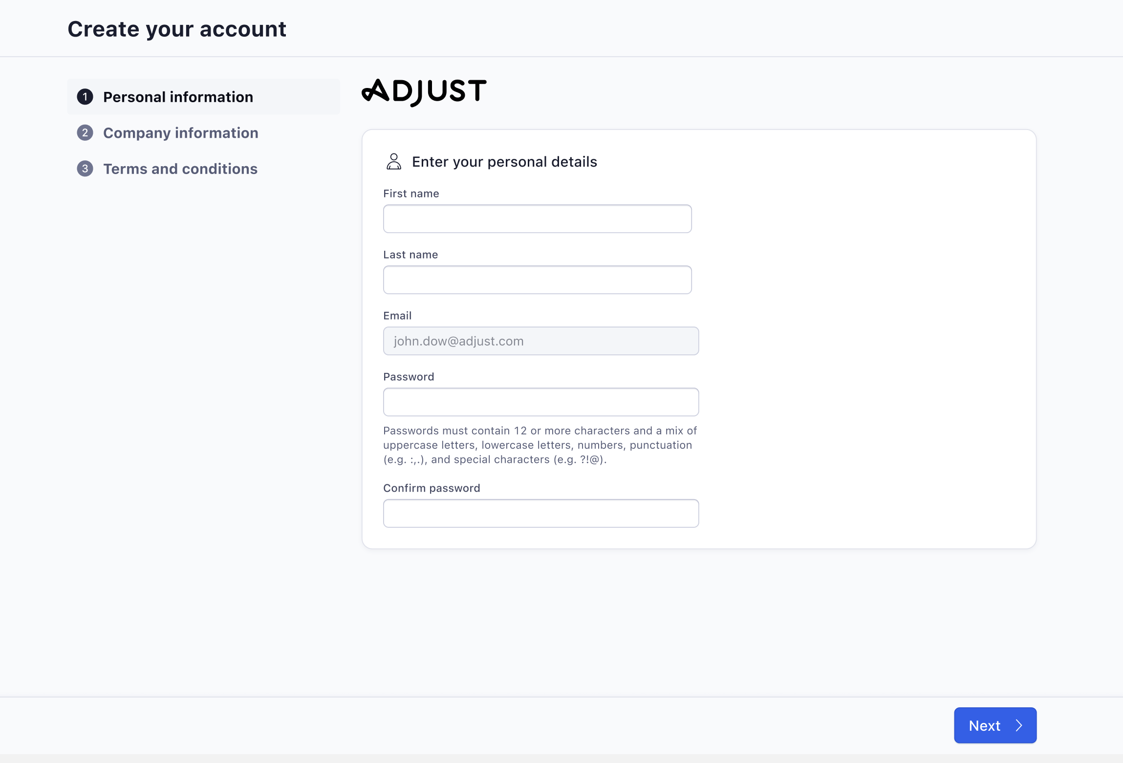
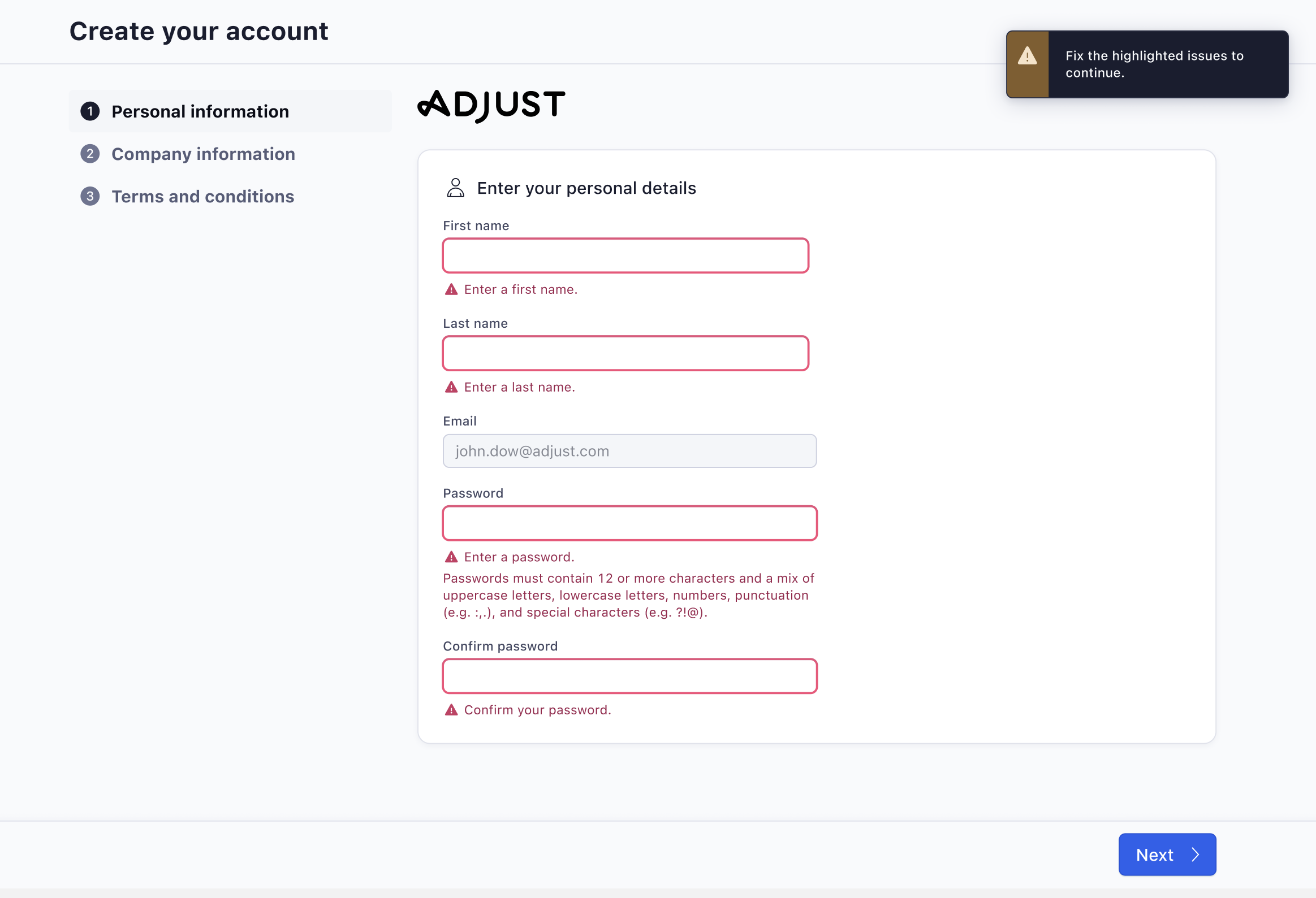
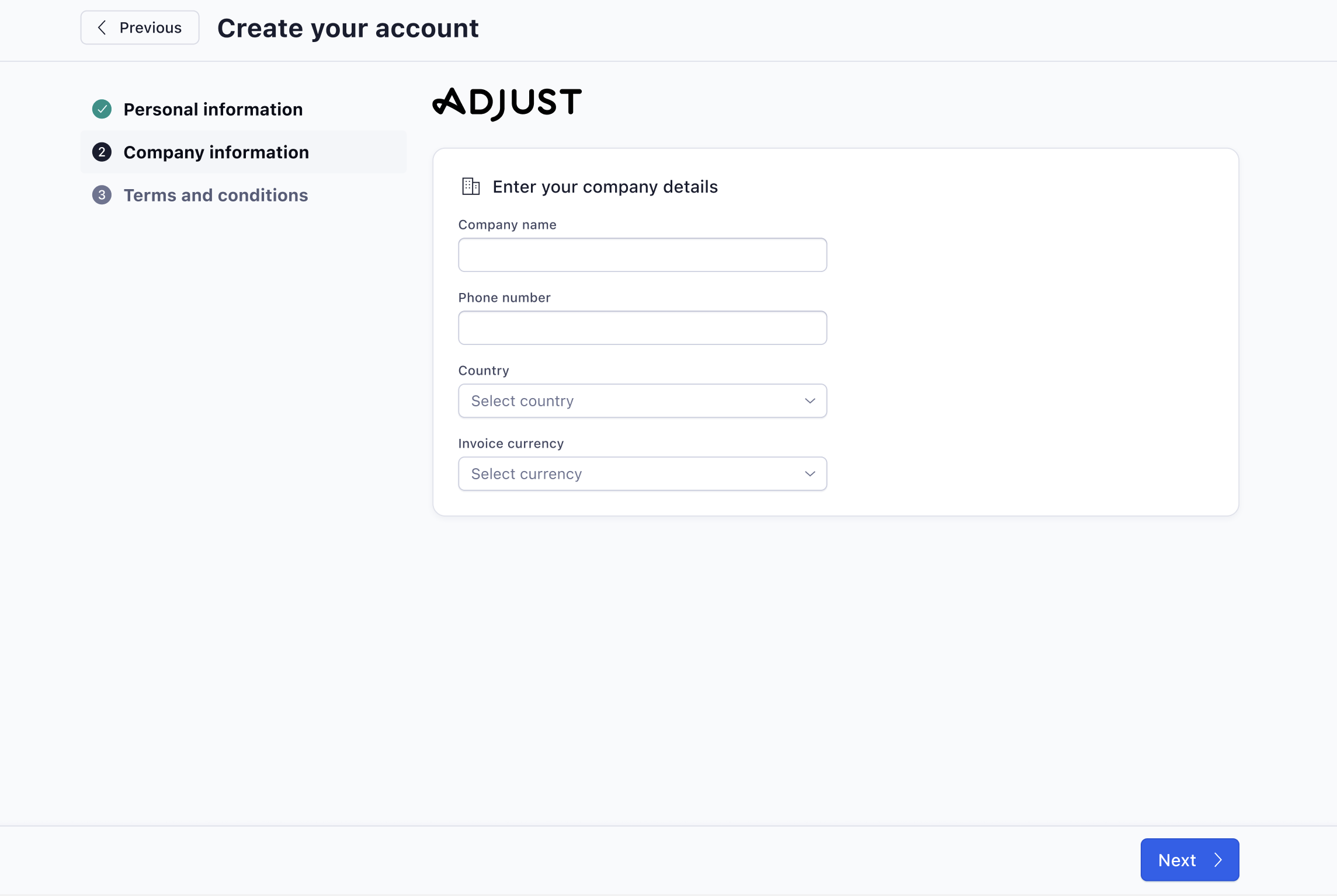
We designed a new sign-up flow within a wizard. This signposts to the user where they are in the flow and how much further is left.
The copy and design are lighter in tone, yet still in keeping with Adjust’s tone of voice guide.
The flow is now smoother and less clunky.
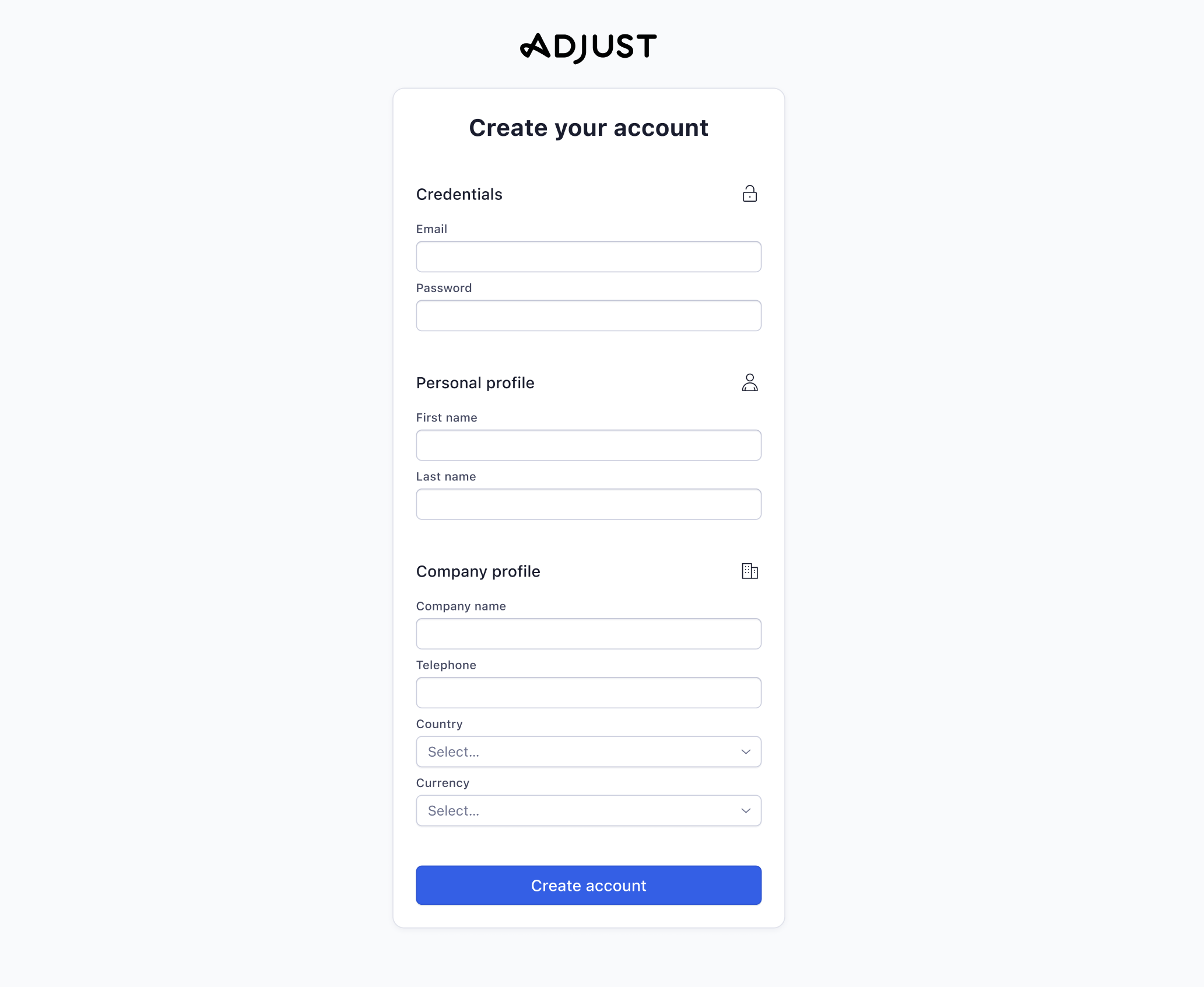
Step 1 - note the wizard on the left hand side showing how much longer is left of the process.
In-line validation was added.
Step 2 - the wizard goes step by step, rather than lots of information at once.
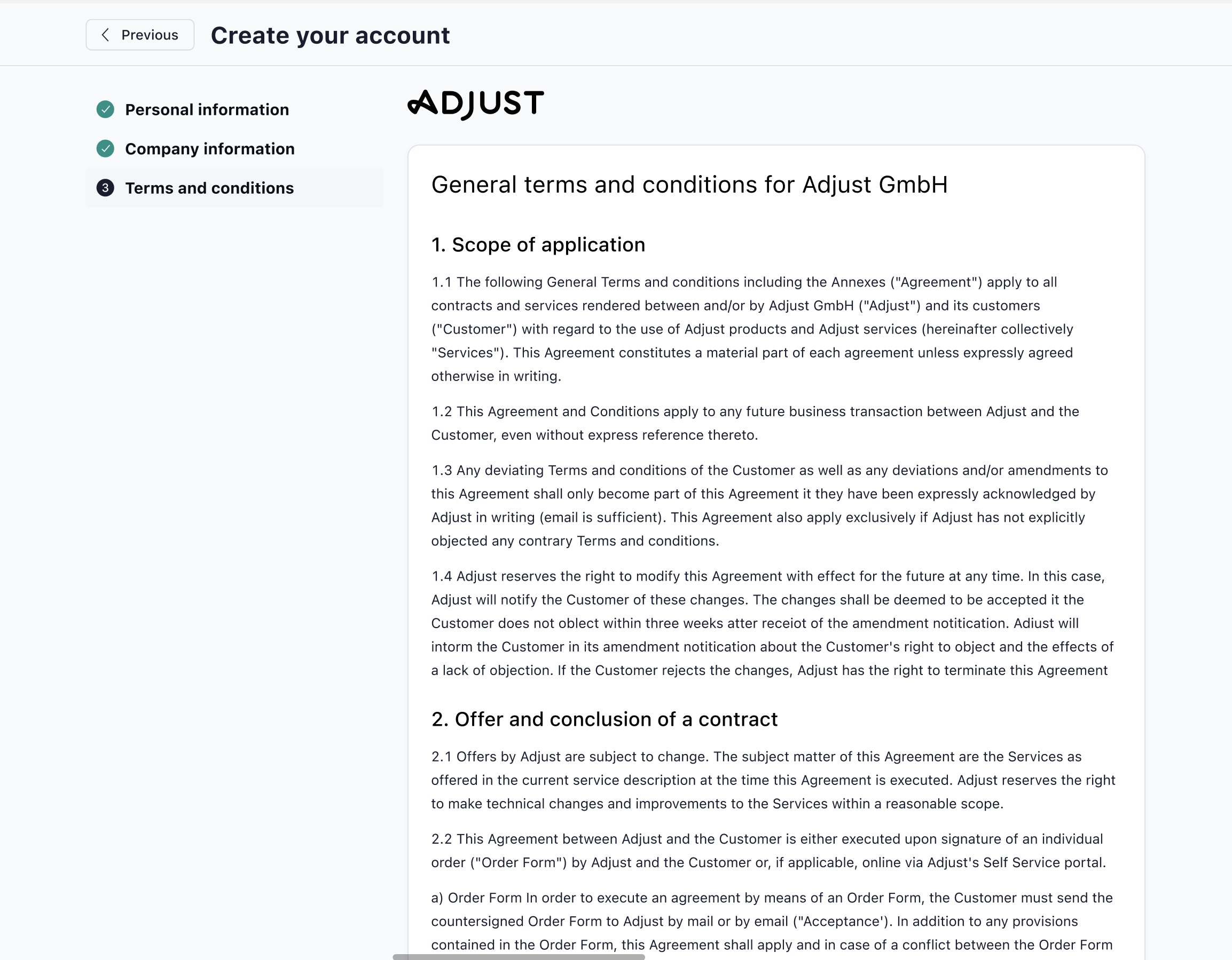
Step 3 - terms and conditions acceptance
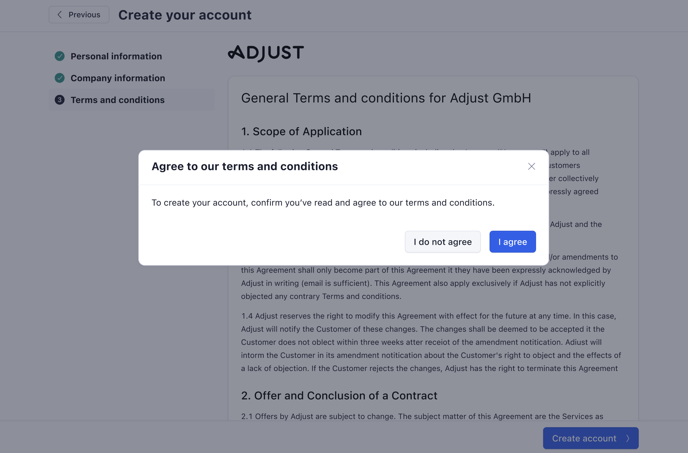
Step 4 - when the user doesn't accept the terms and conditions.
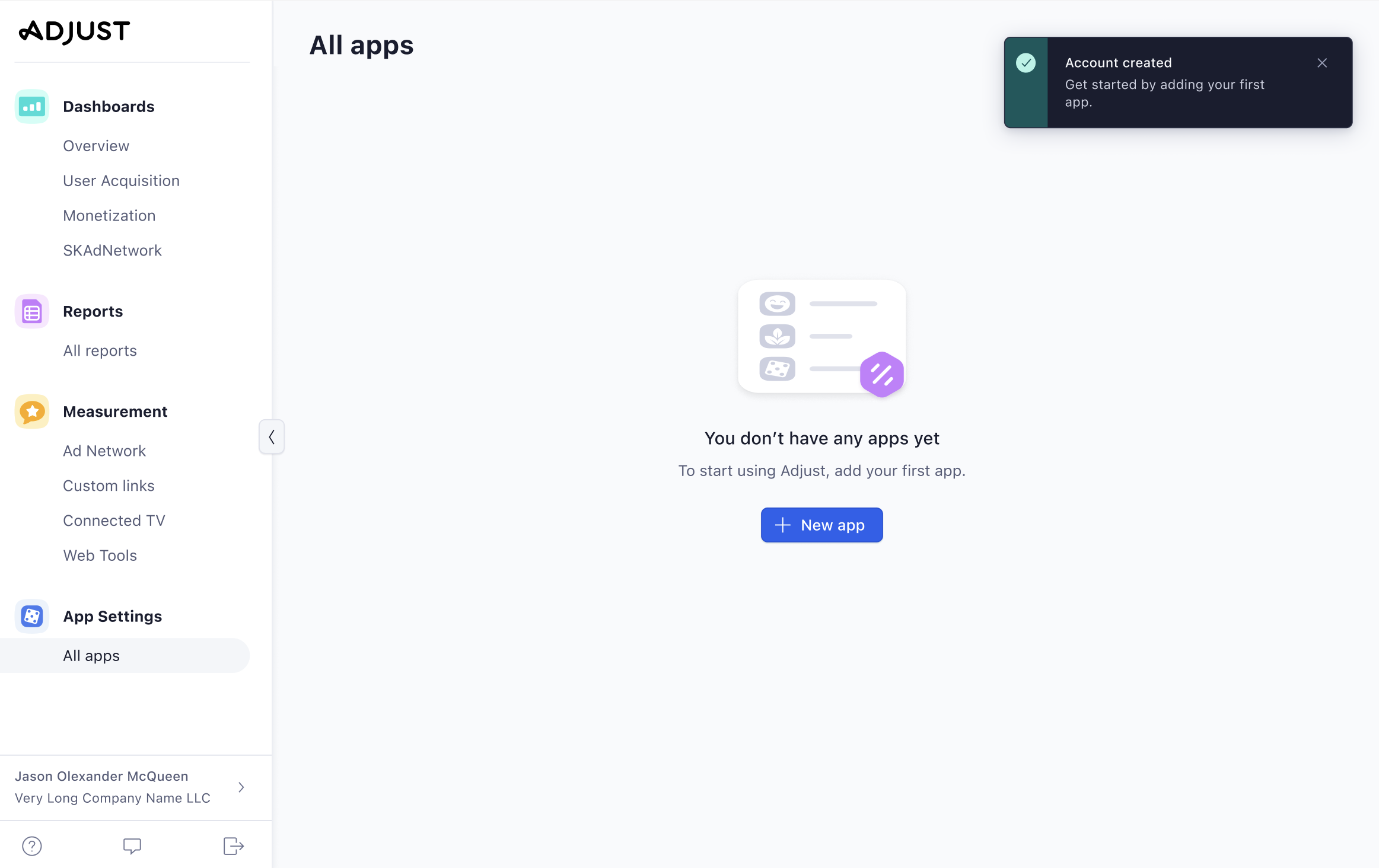
Empty state screen - the user needs to add an app.
How did we arrive at the solution?
We began in Miro by mapping out the new account sign-up flow.
The designer then came up with some early designs in Figma. I gave feedback on them and provided copy.
We received design feedback from the product manager, and technical feedback from the developers and engineers. I also asked for feedback from the UX writing team in our weekly peer review sessions.
We incorporated all feedback to create the final live design.
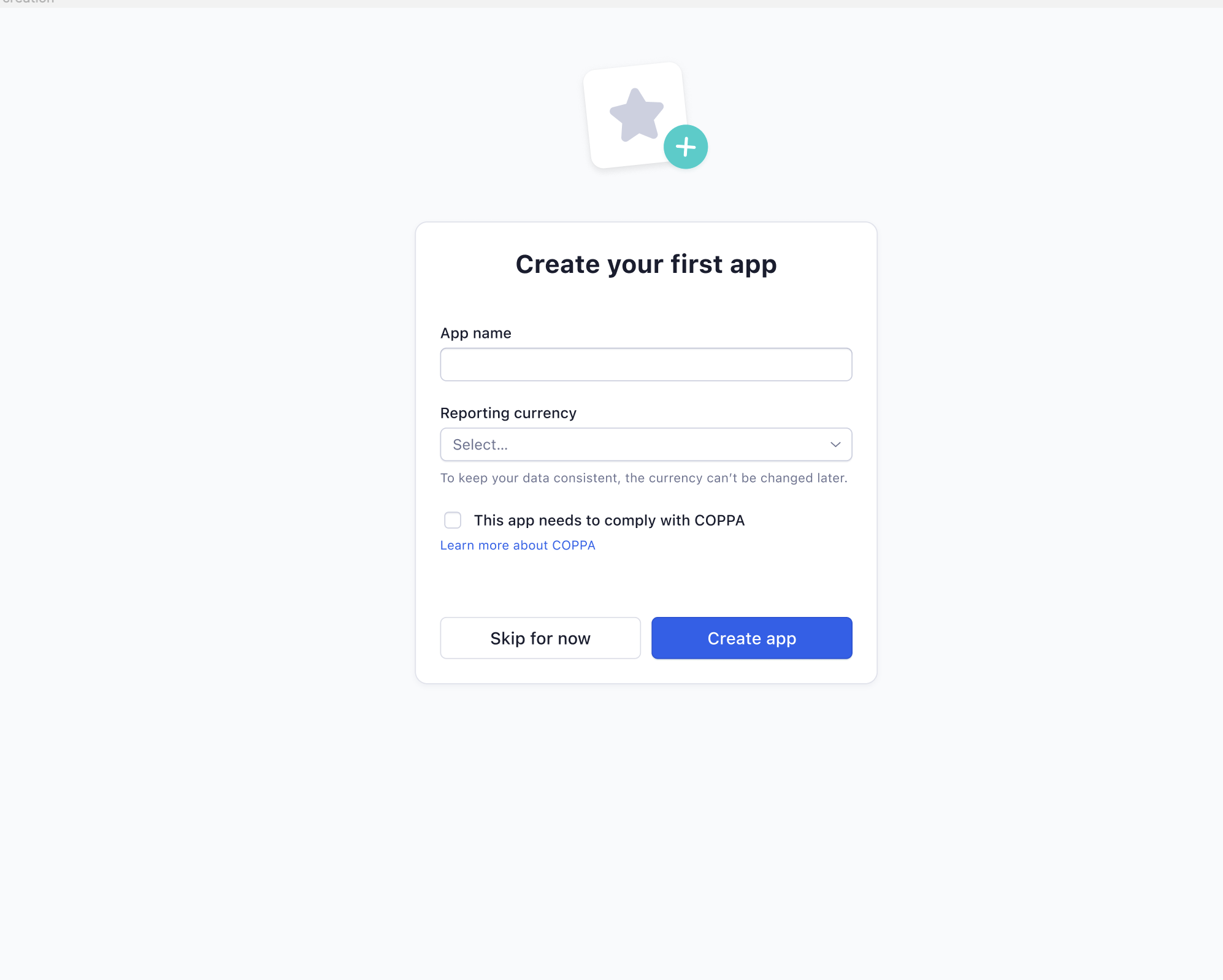
Some early design and copy prototypes are below:
What challenges did I face?
Utilising space was difficult. For example, condensing a complex password requirement to three lines was challenging and took many re-writes and collaboration with my UX writing team to get the wording correct.
As seen in the early prototype, we use the phrase at least 3 of the following: uppercase letters, lowercase letters, numbers, punctuation, special characters. However, this is ambiguous since some users might believe they need at least 3 uppercase letters, at least 3 lowercase letters and so on.
So instead I changed it to a mix of, so the user would use all characters.
What did I learn?
Working within the confines of engineering in terms of in-line error messages. For example, if a user entered an invalid new password, engineering was unable to confirm what exactly was wrong with it (i.e., was there a special character missing?).
I therefore wrote the in-line error message to accommodate these scenarios.
